
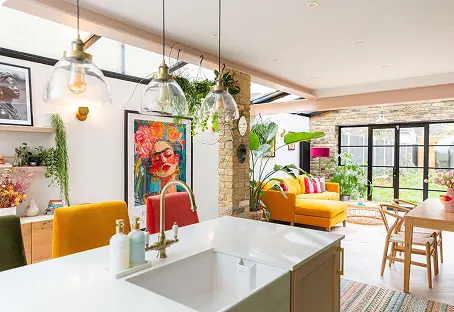
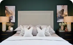


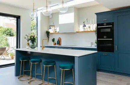
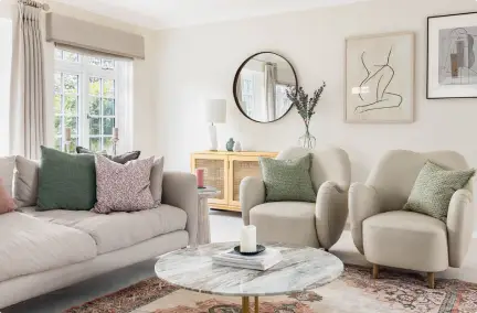
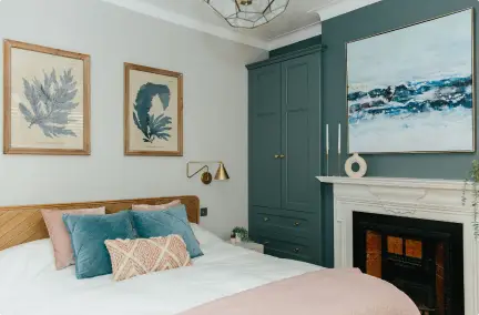












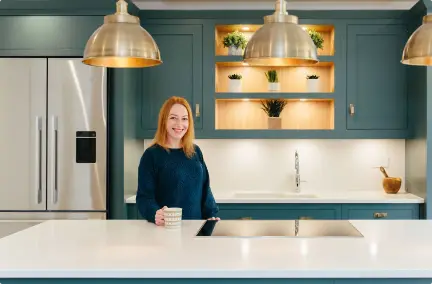
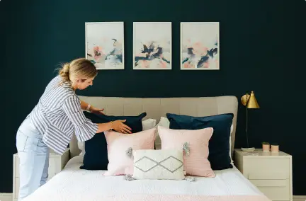
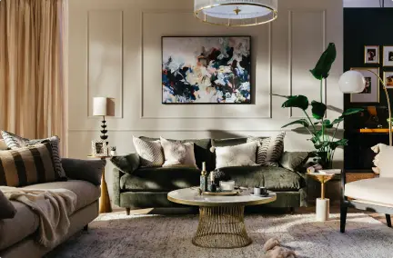

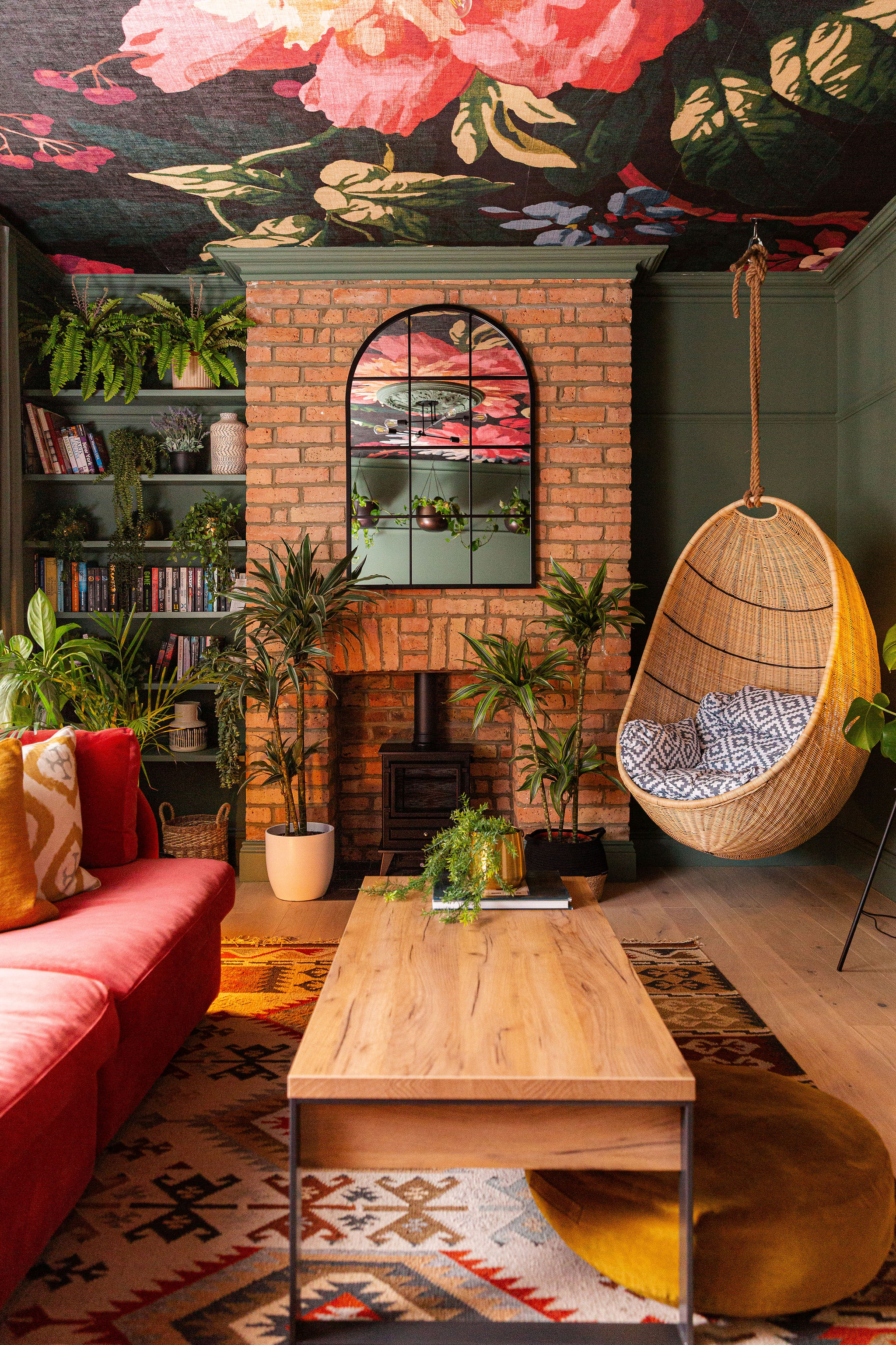
If you like consistency across all surfaces of your home, colour drenching is the way to go. This design style is perfect for those seeking a highly curated, bold space, where every surface works together to envelop you in colour.
At My Bespoke Room, we’re all about creating homes that feel uniquely yours while taking the stress out of decorating. Colour Drenching is one of our favourite designer secrets for achieving high-impact transformation without the luxury price tag.
Let’s unpack what colour drenching actually means, how it differs from traditional painting methods and how you can get that designer-led look in your own home without overwhelming your space.

What Exactly is Colour Drenching?
At its core, colour drenching is the interior design technique of painting every surface in a room in a single paint colour. This includes walls, ceiling woodwork, skirting board, doors, radiators and even window frames.
Traditionally, interior painting relied on contrast: white ceilings, off-white skirting boards and coloured walls. Colour drenching throws that rulebook out of the window. By dissolving the visual boundaries where walls meet ceiling and floors, it creates a seamless envelope of colour that feels immersive and atmospheric.

The Origins: From Victoria Grandeur to Modern Drama
Colour drenching has taken social media by storm over the last few years. Yet, the concept itself is far from new.
- Victorian Grandeur: In the 19th century, wealthy Victorian homes frequently featured deep jewel tones like burgundy, forest green and dark teal. they washed over intricate plasterwork and heavy moulding to create grand spaces lit by candlelight and gaslight.
- Mid-Century Monochromes: The 1970s and 1980s saw a resurgence of monochrome environments where carpet, walls and trim were matched to produce a head-to-toe look.
- The Modern Revival: Today, colour drenching has evolved into a refined art form. Contemporary colour drenching uses rich muted tones, warm neutrals and mixed paint sheens to bring warmth and architectural cohesion to homes of any era.
Colour Drenching vs Monochromatic Design: What’s the Difference?
It’s easy to confuse these two terms, but they actually play distinct roles:
| Feature | Colour Drenching | Monochromatic Design |
| Colour Palette | Single hue throughout: The same paint colour covers walls, trim, ceiling and doors. | Shades and tints: uses varying tones, light-to-dark variations and tints of the same base colour. |
| Vibe | Bold, enveloping, immersive, and high-impact. | Subtle, relaxed, layered and tonal |
| Visual Boundaries | Removes visual breaks completely between architectural elements. | Highlights architectural elements using contrasting lighter/darker shades. |
Key Pillars of a Successfully Colour-Drenched Room
To avoid flatness and build layers into your space, keep these essential principles in mind:

1. Play with Paint Sheens
Using the same colour doesn’t mean using the same finish. Varying paint sheens is the way to add subtle depth to your surfaces:
- Ceilings and Walls: Flat or ultra-matt finish to absorb light and create a soft, velvety backdrop.
- Woodwork, Doors and Radiators: Eggshell, satin or full gloss for durability and a gentle light-reflecting sheen that catches architectural shadow lines.
2. Texture is Non-Negotiable
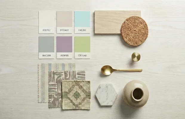
When you eliminate colour contrasts, texture takes centre stage. Layer rich tactile materials throughout the room to give the eye plenty of tactile points of interest. Think bouclé armchairs, chunky wool rugs, slubby linen drapery, brushed brass hardware and natural timber furniture.
3. Mind the Lighting
Colour-drenched spaces rely on warm and ambient lighting. Avoid harsh central overhead bulbs, which can flatten the room. Instead, introduce multi-layered lighting: wall sconces, low floor lamps and table lamps with soft fabric shades to cast pools of light across your backdrop.

How to Work Colour Drenching in Any Room Size
Small Rooms and Narrow Spaces (Powder Rooms, Hallways, Snugs)
Contrary to popular belief, dark or bold colours do not automatically make a room feel smaller. In fact, in smaller spaces like powder rooms or narrow hallways, white trim can create sharp visual breaks that chop up the room. Colour drenching blurs the edges and corners, making the ceiling appear higher and the walls extended.

Large and Open-Plan Spaces
In expansive rooms, colour drenching anchors the environment and brings an immediate sense of cosiness. If you are working with an open-plan layout, use architectural break points such as archways, chimney breasts or door frames to transition intentionally between drenched zones.

4 Common Color Drenching Mistakes to Avoid
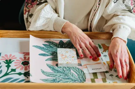
- Skipping Large Paint Swatches: Paint behaves differently on flat wall versus an overhead ceiling or glossy door. Always paint large test swatches on multiple walls and observe them at different times of the day under both natural and artificial light.
- Using Only One Paint Finish Throughout: Painting everything in flat matt can leave a room feeling lifeless. Always mix sheens to capture light and outline your mouldings.
- Ignoring Architectural Detail: If your space lacks crown moulding or picture rails, colour drenching can sometimes feel plain. Consider adding simple wall panelling before painting to create shadows and structural depth.
- Forgetting Radiators and Vent Covers: Leaving white radiators or metallic vent covers untouched ruins the seamless illusion. Use heat-resistant specialist paint tinted to your wall shade to blend functional fixtures into the background.
Have a room in mind? Let’s talk!
Book a FREE 30-minute Designer Call with one of our experienced interior designers.
Tell us about your room, what you’re struggling with and what you’d love to achieve. We’ll listen, talk through your ideas and explain how we could help.
And if you’re not quite sure what your style actually is, take our 2 minute interior style quiz and we’ll show you.

FAQs
Colour drenching creates an instant sense of drama and high-end design.
It blurs room boundaries, making small spaces feel larger and low ceilings feel higher. It’s also easy to execute, with no tedious taping between walls and ceiling trim. However, colour drenching requires commitment. It can be time-consuming to paint over if you change your mind quickly. It can also feel overwhelming if paired with poor lighting or overly saturated primary colours.
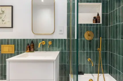
Moody and Atmospheric Tones: Deep forest greens, navy blues, rich terracotta, warm espresso and dark plum work brilliantly in bedrooms, snugs and dining rooms.
Warm and Serene Neutrals: Soft plaster pinks, warm taupe, muted sage and creamy oatmeal are ideal for light-filled living rooms and bathrooms seeking a spa-like feel.
Use a matt or ultra-matt finish for ceilings and walls to minimise glare and absorb light. For skirting boards, architraves, doors and radiators, choose a durable eggshell, satin or soft gloss finish in the same colour match.
