Hands up if you’ve ever fallen head over heels for a paint colour you spotted on Instagram, slapped it on your walls, and thought: yes, I’ve nailed it. Fast-forward a couple of years and suddenly that “dreamy sage green” feels more “sad cabbage soup.” We’ve all been there. Looks like you could do with a neutral that lasts.

Image credit: My Bespoke Room
The truth is, trends have a short shelf life. Tackling your living room, kitchen or any of those big social spaces? Absolute nightmare. Those are the rooms where you want a colour scheme that’s going to go the distance.
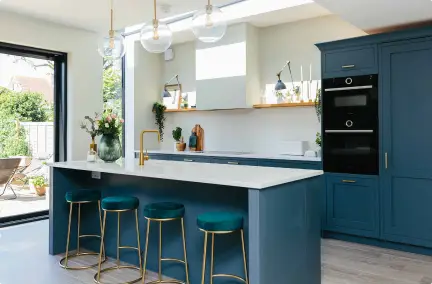
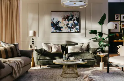
Enter neutrals. But don’t panic, because we’re not talking about soulless magnolia from your first rental flat. Think warm, versatile tones that play nicely with everything. And quietly let your furniture, artwork and personality do the showing off. The best bit? You can change up the look with a few cushions or a new rug. It suddenly it feels like a whole new room – no paintbrush required.
So, are you’re ready to future-proof your walls without sacrificing style? Below are some of our favourite neutrals that will keep your home looking fresh. Long after the Pinterest craze has moved on.
Neutral paints that never go out of style:
Need some quick tips? Watch our designer Sarah walk you through the neutral styles that never go out of date!

- Make sure your colour works with your flooring, your trim and also your woodwork
- Lighting plays a key part – test swatches throughout the day
- Don’t skimp on quality paint!
And don’t forget, the trick is in the undertones
Want to feel more confident about your design choices? Get tailored advice in a FREE 30-minute call.
What does Neutral really mean?

Image credit: My Bespoke Room
Like we said, we’re not advising you to avoid colour at all costs, but equally, we know the ship has sailed on the millennial grey trend…
So, think of Neutrals as tones of your favourite colours.
It isn’t going to be the main feature of all of your rooms. In saying that, the right tone can host all of your favourite pieces together beautifully. Also if you follow the recent trends, it can even connect you with nature.
Lasting painting trends and shifts 2025
As the 2025 season has come to an end, we have been noticing a shift in the neutrals trends. Leaning towards more of a warm, earthy palette including, clay, stone, coffee, and earth.
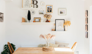
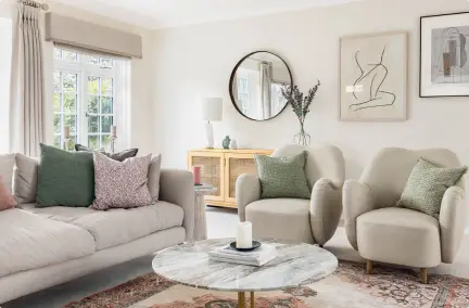
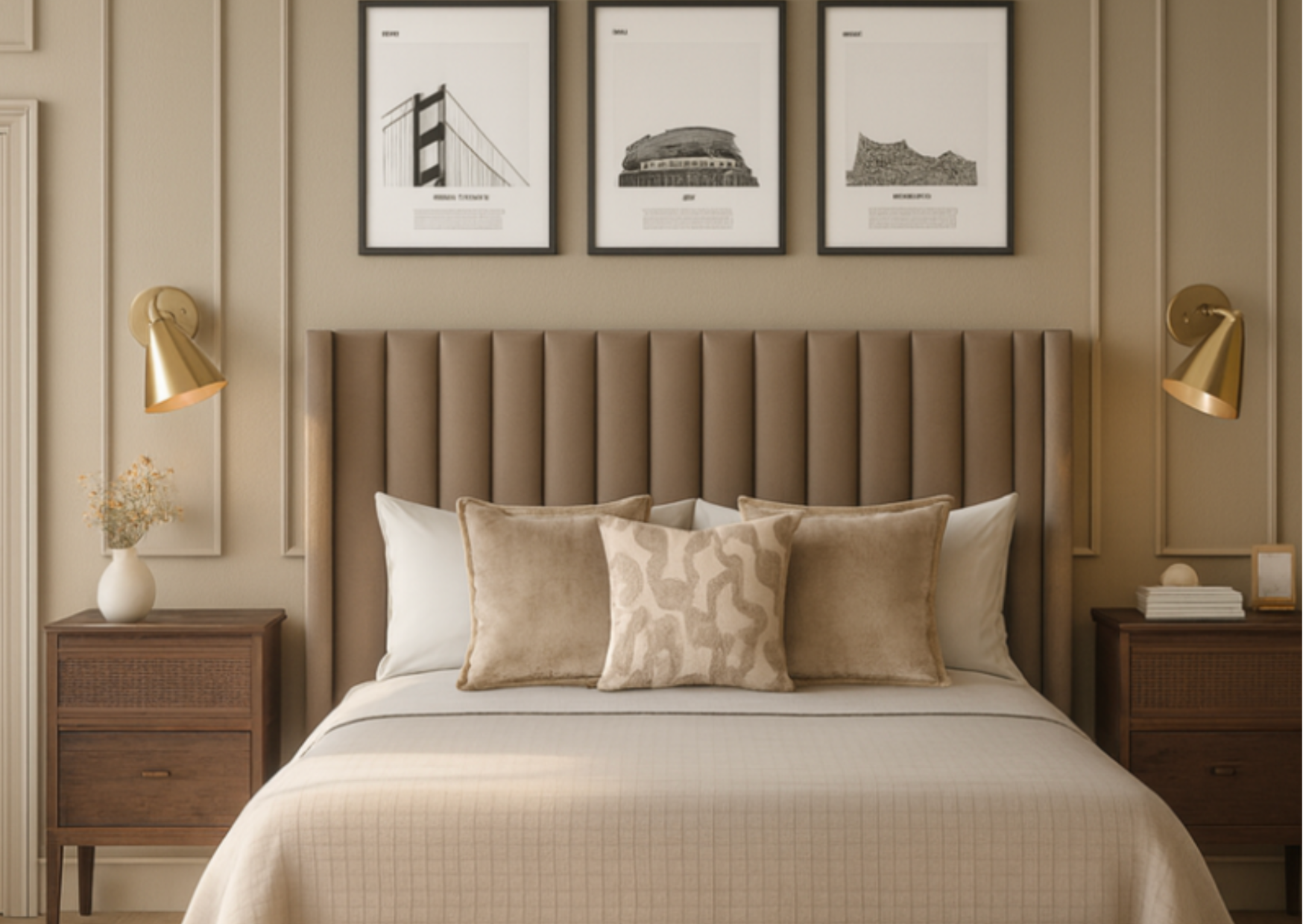
One thing our clients can’t get enough of is layering neutrals. Think of it as mixing your favourite shades of beige, cream, taupe, grey, and soft browns all in one space. Like a perfectly blended coffee order … but for your walls.
Instead of sticking with one dull colour, we play with light, mid, and deep tones to build a soft, tonal look that feels anything but boring. And here’s the secret ingredient: metal accents.
A splash of brass, chrome, or matte black instantly wakes up a neutral room! By adding contrast, texture, gives just the right amount of luxury – depending on the finish you go for.

Image credit: My Bespoke Room
5 Common pitfalls and how to choose a neutral that lasts
1. Under thinking Undertones
Like Sarah said, when choosing neutral paint colours, one of the most important things to watch for is undertones. Even if a shade looks like a “true” beige, grey, or white on a paint chip, it can sometimes carry subtle hints of green, blue, pink, or yellow. This becomes much more obvious once the paint is on your walls.
2. Forgetting the impact of natural light
Natural light in particular can completely change how those undertones appear. North-facing rooms often make colours feel cooler, while south-facing light can bring out warmth. We recommend always test a sample. Particularly in the actual space at different times of day before committing to a full wall. We know it sounds like a lot, however, future you will thank you!
3. Choosing the wrong neutral shades
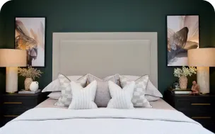
Another common pitfall is relying on neutrals that are too flat or sterile. Crisp whites and cool greys have their place. However, a room painted entirely in these tones can sometimes feel cold, stark, or even clinical. Now how do we avoid feeling like you’re sitting in a waiting room? Consider adding layers! Choose neutrals with soft, warm undertones or by pairing them with deeper, richer shades for balance. The goal is to create a neutral backdrop that feels alive and inviting, not one that looks as washed out as a t-shirt after three spins in the washing machine
4. Failing to pick quality paint
Quality also matters more than people realise. High-end paints aren’t just about prestige; they contain stronger pigments, smoother finishes. Which, in turn, means your walls will hold their colour and resist fading over time. A well-pigmented neutral has depth and character. Whereas cheaper paints can look chalky, flat, or uneven after only a few coats. Investing in good materials at the start often saves money and frustration in the long run.
5. Trims, Ceilings and Woodwork.
Don’t forget that walls are just the start. Trim, ceilings, and woodwork often fly under the radar! Yet, when treated thoughtfully, they’re the glue that makes a room feel truly harmonious. Choosing a gently different shade for trim adds subtle definition. While carrying the same tone across walls, woodwork and ceiling gives a look that feels clean, modern, and beautifully consistent. Whichever route you go, consistency is everything. These elements shouldn’t feel like afterthoughts. A well-planned palette that embraces every surface is what elevates a room. From nice to intentional, whether it’s standing proud by itself or joining the rest of the décor ensemble.
Fancy a quick 30-minute fix? Book a FREE call with one of our designers today—and get that fresh spark back in your space.
Case Inspiration
Contemporary, Scandi Living Room:

Image credit: My Bespoke Room
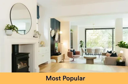
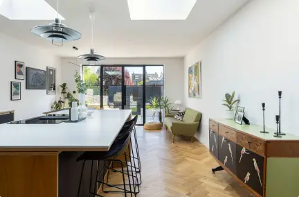
Together, these layers of neutral tones create depth and texture, proving that a neutral palette can be anything but boring. Add accents. Metallic lamps here, a warm wooden table there. Your whole room will feel alive, sophisticated, and effortlessly cozy. Like it’s ready for a solo coffee moment or a full-on friend gathering.
Remember what we said about the trim and woodwork? This is the perfect example of how it quietly shows off their subtle definition without stealing the spotlight.
Modern and Classic Living Room:

Image credit: My Bespoke Room
Akhila’s Living Room
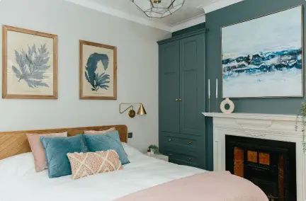
You instantly feel like you’ve walked onto a set where modern cool meets classic charm, and somehow they’re best friends. The walls wear a rich green coat that’s bold but not bossy, perfectly playing off the intricate wall panelling. This adds just the right amount of depth and texture.
Traditional Lounge:

Image credit: My Bespoke Room
A room warm and inviting. Wrapped in a gentle hug of soft pinks and blues and just a little bit charmingly nostalgic. The walls wear a dusky pink like they’ve been blushing all day, while a single side flaunts a striking Morris & Co. Snakeshead wallpaper with the neutrals allowing it to be the star of the show!
A quick chat with one of our designers could save you hours of second-guessing. Book a FREE call with an expert today.
