















Neutral paint colours remain the backbone of British interior design. They bring calm to bustling households, bounce light around narrow spaces, and provide a versatile backdrop for evolving furniture and artwork. Yet, choosing the right neutral is rarely as simple as picking up a tin of “Brilliant White.”
With thousands of subtle undertones, ranging from pink and yellow to green and violet, a neutral shade that looks soft and welcoming in a sunny south-facing kitchen can quickly turn cold and dreary in a dim hallway.
Instead of chasing short-lived seasonal trends, this practical room-by-room guide breaks down the science of neutral undertones, explains how to handle challenging low-light spaces, and helps you select the exact neutral paint for every room in your home.

Understanding Neutral Families: Beige vs. Greige vs. Taupe vs. Off-White
Before selecting a paint for a specific room, it helps to understand the four primary families of neutral colours. The secret to a successful scheme lies in matching these undertones to the orientation of your windows and the artificial light in your space.
Beige
Beige is back, but it has evolved far beyond the yellowish tones of the late 1990s. Modern beiges are warm, earthy, and grounded by yellow, red, or pink undertones. They excel at adding instant warmth, making them an ideal choice for cool or shadow-prone British rooms.
- Undertones: Warm yellow, gold, subtle red, or terracotta.
- Best Used For: North-facing rooms, shadowy spaces, and traditional or rustic interior styles.
- Pairs Well With: Warm timber, brass fixtures, rich terracotta, and olive greens.

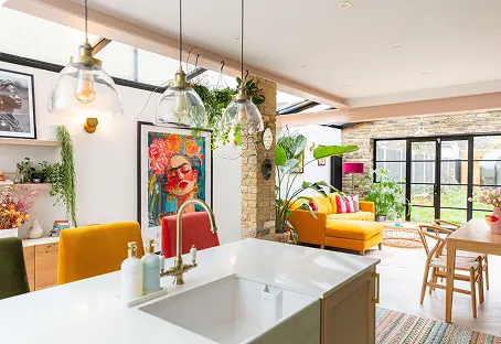
Explore this beautiful home transformation
Our designers’ favourite beige paint colours:
Greige
A harmonious blend of grey and beige, greige is arguably the most adaptable neutral in modern interior design. It retains the crisp, clean sophistication of grey while borrowing enough warm beige pigment to prevent a room from feeling clinical under overcast UK skies.
- Undertones: Balanced mix of cool grey and warm yellow/ochre.
- Best Used For: Open-plan spaces, south-facing rooms where pure beige might look too yellow, and modern homes seeking a calm, flexible backdrop.
- Pairs Well With: Black accents, washed linen, natural oak, and muted sage.

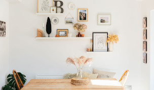
Step inside Laura’s stunning house
Our designers’ favourite greige paint colours:
Skimming Stone – Farrow & Ball
Taupe
Taupe sits comfortably between brown and grey, defined by its complex violet, red, or subtle pink undertones. It is a richer, moodier neutral that adds depth and understated elegance without overwhelming a space. Taupe shifts dramatically throughout the day, feeling light and airy in morning daylight and cosy under evening lamps.
- Undertones: Violet, pink, grey, and soft brown.
- Best Used For: Bedrooms, formal dining areas, and sitting rooms where you want a cocoon-like atmosphere.
- Pairs Well With: Brushed nickel, velvet upholstery, plum, deep navy, and crisp white trim.

Our designers’ favourite taupe paint colours:
Off-White
Off-whites are pure white paints softened with minute amounts of yellow, grey, green, or pink pigment. They eliminate the harsh glare of stark white while maintaining maximum light reflection. Choosing the right off-white depends entirely on balancing the natural light entering the room.
- Undertones: Vary widely from cool (blue/grey) to warm (yellow/cream/pink).
- Best Used For: Ceilings, woodwork, small spaces needing a light boost, and contemporary, minimalist interiors.
- Pairs Well With: Almost all colour palettes, serving as a unifying neutral frame.

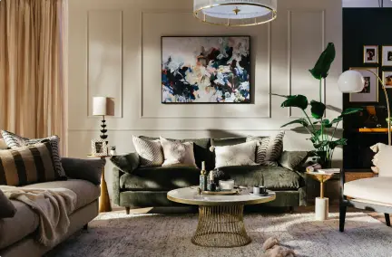
Click here to explore this living room design with panelled feature wall
Our designers’ favourite off-white paint colours:
How to Handle Low-Light and North-Facing Rooms
Low-light spaces, such as north-facing rooms, basement conversions, and windowless hallways, receive cool, blue-toned natural light. Cool light flattens colours and accentuates blue or green undertones. If you paint a low-light room in a cool grey or crisp stark white, the room will likely feel cold, gloomy, and uninviting.
When painting low-light rooms, follow these three rules:
- Embrace Warm Undertones: Always choose neutrals with red, yellow, pink, or warm ochre undertones. These pigments neutralise the cool blue tint of northern light.
- Avoid Pure White: Pure white requires abundant natural light to look bright. In dark rooms, it turns a dull, shadowy grey. Opt for a warm off-white or a soft cream instead.
- Leaning Into the Shadow: If a room receives almost no natural light, do not force it to look bright with pale paint. Instead, consider a medium-toned taupe or deep greige to embrace the shadow and create an intentionally cosy space.
Our designers’ favourite paint colours for north facing rooms:
Room-by-Room Neutral Paint Selection Guide
The Living Room
The living room needs to transition seamlessly from a bright, functional space during the day to a relaxed, intimate sanctuary in the evening.
- For Bright, South-Facing Living Rooms: Use a balanced greige or cool off-white. The abundant warm sunlight will naturally highlight the yellow tones in the paint, so a cooler neutral keeps the space feeling fresh and balanced without looking overly warm.
- For Cool, North-Facing Living Rooms: Choose a warm, mid-toned beige or a dusty taupe. The red or yellow undertones will combat the cool light, casting an inviting, golden hue across the walls as daylight fades.
- Pro Tip: Paint your skirting boards and window frames in the same neutral shade as the walls, but in an eggshell or satin finish. This colour-drenching technique softens visual boundaries and makes living rooms feel noticeably larger.

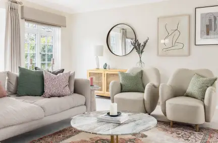
Explore this beautiful and classic living room design
Our designers’ favourite neutral paint for living rooms:
Elephant Breath – Farrow & Ball
The Kitchen
Kitchens are filled with hard surfaces like stone countertops, tiled splashbacks, and stainless steel hardware. The right neutral paint softens these elements and creates a cohesive backdrop for cabinetry.
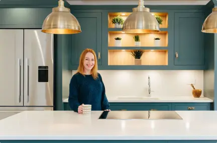
- Cabinetry Backdrop: A soft, stone-tinted off-white or light greige on the walls provides just enough contrast against both dark navy/forest green cabinets and classic oak joinery.
- Open-Plan Kitchen-Diners: Stick to a versatile, pale greige. It bridges the functional zone of the kitchen and the softer lounging area of the dining space without visually fracturing the room.
- Pro Tip: Kitchen walls require frequent wiping. Ensure you choose a durable, washable matt finish rather than a standard soft matt, especially around cooking and prep areas.

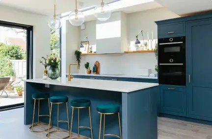
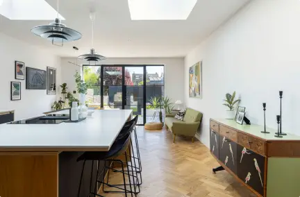
Step inside this beautiful Victorian-semi renovation
Our designers’ favourite neutral paint for kitchens:
The Master Bedroom
Bedrooms demand a palette that promotes restful sleep and relaxation. Highly reflective off-whites can feel too energising, making richer, cocooning neutrals the ideal choice.
- Ideal Choice: A warm taupe or a deep, velvety greige.
- Why It Works: Taupe brings an inherent depth that feels luxurious under low-level bedside lamp lighting. The subtle pink or violet undertones create a soft, soothing atmosphere that aids rest.
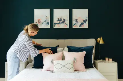
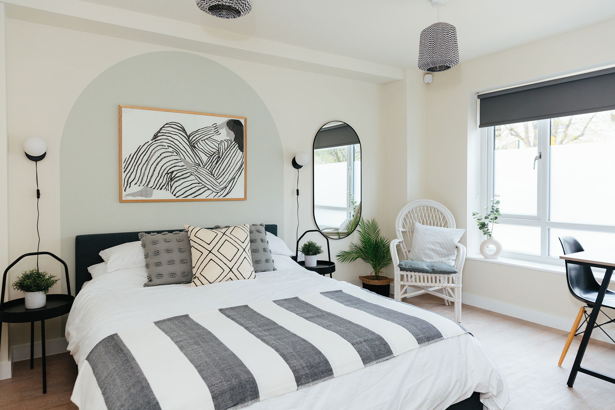
- Pairing: Combine taupe walls with crisp, warm-white bed linen and natural timber headboards to keep the space anchored and balanced.

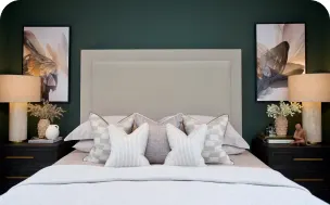
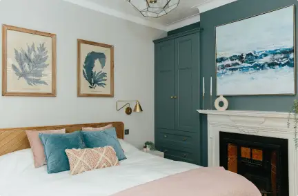
Explore this calm and serene bedroom design
Our designers’ favourite neutral paint for bedrooms:
Portland Stone – Little Greene
The Hallway and Landing
Hallways are the spine of the home, connecting different rooms while often lacking direct sunlight. They need a neutral that feels welcoming at the front door while flowing naturally into adjacent spaces.
- Ideal Choice: A light-reflecting, warm off-white or a pale yellow-based beige.
- Why It Works: These shades bounce whatever light is available up stairwells and through narrow passages, preventing entrance halls from feeling claustrophobic.
- Pro Tip: Because hallways experience heavy foot traffic, select a warm neutral with a slight green or yellow base; these undertones are exceptionally forgiving when it comes to everyday scuffs and marks.

Explore this hallway & landing design with statement chandelier
Our designers’ favourite neutral paint for hallways:
The Home Office
A home office neutral needs to strike a delicate balance: it must offer enough clarity to foster focus without feeling sterile or distracting during long working hours.
- Ideal Choice: A crisp, clear greige or a muted slate-tinged off-white.
- Why It Works: Greige provides a clean, clutter-free visual environment that reduces eye strain on video calls and keeps your mind clear. It offers enough warmth to feel comfortable through winter workdays without inducing drowsiness.
- Pairing: Accent your workspace with dark wood desk surfaces, green foliage, and warm brass desk lamps to introduce natural texture.

Explore this mid-century modern home office design
Our designers’ favourite neutral paint for home offices:
The Bathroom
Bathrooms rely heavily on artificial lighting and feature cold porcelain and tile surfaces. The goal is to choose a neutral that flatters skin tones in the mirror while feeling clean and spa-like.
- Ideal Choice: A soft, plaster-inspired beige or a delicate, warm-tinted off-white.
- Why It Works: Avoid cool grey in the bathroom—it reflects a greenish, unflattering tint onto skin under artificial bulbs. A warm beige or plaster neutral casts a soft, radiant glow and softens the hard edges of glass and tile.
- Pro Tip: Always use a moisture- and steam-resistant bathroom emulsion to prevent peeling and mould growth in humid environments.

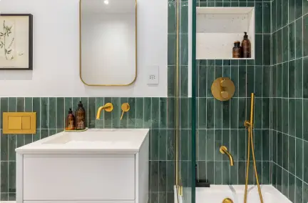
Step inside this elegant bathroom design
Our designers’ favourite neutral paint for bathrooms:
Practical Rules for Testing Neutral Paints
To ensure your chosen neutral looks flawless in your home, never rely solely on digital screens or printed colour cards. Follow these four practical testing rules before buying your final paint tins:
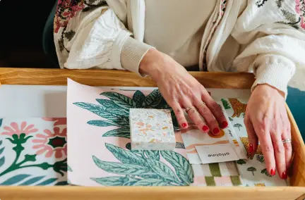
- Paint Large Sample Boards: Never paint test patches directly onto existing painted walls – the old wall colour will distort your perception of the new shade. Instead, paint large pieces of A3 lining paper or cardboard with two full coats.
- Move the Sample Around: Tape your sample board to different walls throughout the day. Observe how the paint looks near windows, in shadowy corners, and under artificial lighting at night.
- Check Against Fixed Elements: Hold your sample board directly against items you cannot easily change, such as flooring, kitchen worktops, tiled splashbacks, and heavy curtains.
- Observe at Different Times of Day: A neutral shade can look bright and creamy at 10 AM, balanced at 2 PM, and distinctly taupe or grey by 7 PM under warm lamp light. Always test over a full 24-hour cycle.

